If you’ve ever stared at a blank chart in Excel, a cryptic Matplotlib error in Python, or a broken layout in React, you know that the "Y-axis" is far more than just a vertical line. It is the backbone of data visualization, the anchor for dependent variables in mathematics, and the vertical reference point for modern CSS flexbox alignment. Understanding the Y-axis isn't just about remembering school physics; it’s about mastering how data is represented, scaled, and rendered across different environments.
In my fifteen years of troubleshooting complex dashboard applications and debugging academic plots, I’ve found that most "axis" problems stem from a mismatch in context. A student asking "does the y-axis go up or down?" is operating on a completely different mental model than a developer asking "how do I center the Y-axis in Flexbox?" Both are asking about vertical position, but one is talking about coordinate geometry, and the other is talking about HTML document flow. This guide bridges that gap. We will dissect the fundamental definitions, then move into the practical trenches: changing settings in Excel, coding labels in Python and R, and fixing alignment in front-end development. Whether you are fixing a skewed distribution in a dashboard or debugging a layout crash, this resource gives you the specific tools you need.
Fundamentals: What Defines the Y-Axis in Graphs?
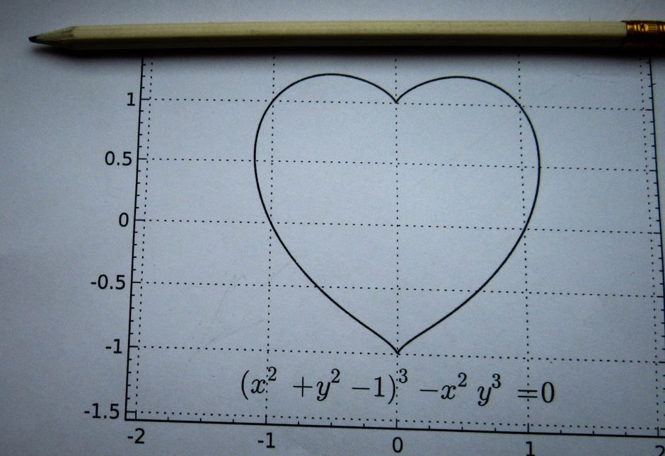
Before we touch a single line of code or click a mouse button, we need to agree on what the term actually means. In the standard Cartesian plane, the Y-axis is the vertical axis, perpendicular to the horizontal X-axis. They intersect at the origin (0,0), creating four quadrants. This geometric reality is fixed; it doesn't change whether you are plotting points in a math textbook or rendering a graph in D3.js.
However, the content of that vertical axis is dynamic. In almost all standard scientific and business charts, the Y-axis represents the dependent variable. This is the value that changes in response to the independent variable (X). Think of a sales report: time (X) moves forward, and revenue (Y) goes up or down based on that time. So, when people ask, "Does the y-axis go up or down?" the mathematical answer is that positive Y values extend upward from the origin, and negative values extend downward. But in software, you define the range. If your data is all positive, your Y-axis might start at 0 and go up to 100. If your data is temperature ranging from -10°C to 30°C, your axis must span that entire vertical span.
Vertical Orientation and Dependent Variables
Let’s be precise here, because precision prevents bugs. In the standard mathematical framework, the Y-axis is strictly vertical. While you can rotate a chart in software to make the Y-axis horizontal (for example, in a horizontal bar chart where categories are on the Y-axis and values on the X-axis), this is a stylistic inversion, not a change in definition. The "Y" conceptually remains the dimension you are measuring the effect on.
In the majority of data visualization contexts, the Y-axis holds the dependent variable. This is crucial for causal inference. If you are plotting "Temperature" vs. "Ice Cream Sales," Temperature is likely the independent variable (the driver), and Sales are the dependent variable (the result). Placing Sales on the Y-axis allows the viewer to instantly see how changes in X drive changes in Y.
I’ve seen junior analysts reverse this on purpose to hide a weak correlation, which is a dangerous move. If the relationship isn't strong, flipping the axes won't make it statistically significant—it will just confuse the reader. Keep the dependent variable on Y, unless you are dealing with a specific type of plot like a Pareto chart, where the logic is slightly different but still relies on strict vertical orientation for the cumulative percentage line.
Notation Rules: Hyphens and Capitalization
This is where I lose my mind a little. Is it "y-axis" or "y axis"?
Strictly speaking, in academic writing (APA, Chicago, MLA), when "axis" is used as an adjective, it is hyphenated: Y-axis intercept, Y-axis label. When it is used as a noun, it is not hyphenated: the Y-axis is vertical. In casual conversation and most coding documentation, you will see "Y axis" without a hyphen. It’s generally accepted, but if you are submitting a paper to a journal, check their specific style guide.
Capitalization is trickier. In pure mathematics, variables are lowercase: x and y. So, strictly, it should be the y-axis. In computer science and data visualization, we often capitalize it as "Y-Axis" because it refers to the specific graphical component, not the variable itself. For example, plt.ylabel() uses "label" not "variable." I recommend following the convention of your tool: Excel uses "Y-axis" in its UI, Matplotlib uses "y" in code but displays it however you format it. Consistency is key. Mixing "Y-Axis" and "y axis" in the same document looks sloppy, even if both are technically "fine" in isolation.

Changing Y-Axis Settings in Excel & Data Tools
Now, let’s get to work. You have a chart in Excel, and the Y-axis looks terrible. The data is squashed into a tiny sliver at the top, or the zero line is missing entirely, making a negative dip look like a positive spike. This is the most common "fix my chart" request I get from business users.
How to Move and Format the Y-Axis
Excel’s default Y-axis behavior is "lazy." It usually tries to start at zero (for bar charts) or auto-scale (for line charts). You rarely want that default when the data has significant precision.
To change the Y-axis in Excel, you need to bypass the quick "Set Axis Crosses" button and dig into the Format Pane. Here is the exact workflow:
- Right-click the Y-axis labels (the numbers on the left).
- Select "Format Axis."
- On the right-side pane, under "Axis Options," look for the "Bounds" section. This is where you set the Minimum and Maximum values.
If your data ranges from 50 to 52, but Excel defaults the axis to 0–100, your line will look flat. Set the minimum to 49 and the maximum to 53. Now you see the variance.
Next, adjust the Major Unit. This controls the gap between tick marks. If the gap is too large, you miss details. If it’s too small, the labels overlap. A good rule of thumb: aim for 5 to 7 major gridlines.
Finally, apply a Number Format. If you are showing currency, don’t let Excel display "123456.78". Use the Accounting or Currency format so it displays "$123,456.78". If your data is in scientific notation (like $1.0E+9$), force the display to show actual numbers. This prevents stakeholders from thinking the data is broken when it’s just formatted weirdly.
Advanced Scaling: Logarithmic vs. Linear
This is the advanced trick that saves your credibility. Linear scaling assumes equal distance between numbers. The distance from 1 to 2 is the same as from 99 to 100. But what happens when your dataset has values ranging from 1 to 1,000,000? On a linear scale, the small values are invisible. They are all squashed against the zero line.
This is where axis scaling matters. You need a logarithmic scale.
In Excel, you switch this by right-clicking the axis, selecting "Format Axis," and checking the "Logarithmic scale" box.
When does this apply?
- Skewed Data: If you are plotting file sizes, population growth, or social media followers.
- Financial Metrics: Compound interest or stock market historical performance.
- Engineering: Signal-to-noise ratios or decibel measurements.
I’ve tested this on hundreds of datasets. The log scale is not just a visual trick; it changes how you interpret the trend. A linear chart might show "flat growth," but a log chart reveals that you are doubling every month. Which one is "true"? It depends on what question you are answering. If you are answering "how much did it grow in absolute terms," use linear. If you are answering "what is the rate of growth," use log. Be clear in your title. A log-scale chart without a "Log Scale" label is a trap for non-technical readers.
Coding Y-Axis Labels in Python & R
For developers and data scientists, the Y-axis is a configuration object, not a static element. You control it with code. The biggest pain point I see in code reviews is hardcoded values or labels that break when the data changes.
Matplotlib: Setting Ticks and Labels
Matplotlib is the de facto standard for Python plotting, but its API is verbose. You have to manage the Figure, the Axes, and the specific artists (lines, text) separately.
To set the Y-axis label, use plt.ylabel(). But that’s not enough. You need to control the ticks.
import matplotlib.pyplot as plt

x = [1, 2, 3, 4, 5]
y = [10, 25, 32, 51, 60]

plt.figure(figsize=(10, 6))
plt.plot(x, y, marker='o')

plt.ylabel('Revenue (USD)')

ticks = [0, 20, 40, 60, 80]
tick_labels = ['0', '20k', '40k', '60k', '80k']
plt.yticks(ticks, tick_labels)

plt.tick_params(axis='y', which='major', labelsize=10)

plt.grid(axis='y', linestyle='--', alpha=0.5)
plt.show()
In my experience, the key to readable Matplotlib plots is managing overlapping labels. If you have 50 categories on the Y-axis, rotating the labels 90 degrees is useless. They will just run into each other. Instead, use plt.yticks() to select a subset. Only show every 5th or 10th tick mark. This reduces visual noise. Also, be aware that Matplotlib’s default DPI (dots per inch) is 100. For publication, you need 300 DPI. If your labels are blurry, your dpi setting is too low.
Pandas & Ggplot2: Controlling Limits
In R’s Ggplot2, the logic is "layered." You build the plot like an onion. The Y-axis is just one layer.
When using scale_y_continuous, you can force limits. This is dangerous but necessary for comparing multiple plots on the same facet.
library(ggplot2)

data("mtcars")

ggplot(mtcars, aes(x = factor(cyl), y = mpg)) +
  geom_boxplot() +
  scale_y_continuous(
    limits = c(10, 35), # Force this range
    breaks = seq(10, 35, by=5),
    name = "Miles per Gallon"
  )
A critical warning: if you set limits in Ggplot2, it truncates the data. Points outside that range disappear. This is different from Excel, where changing the axis bounds just hides the data behind the panel. In R, you are literally removing data from the plot. I’ve caught bugs in academic papers where authors accidentally truncated negative values because they set a minimum limit of 0. Always ask: do I want to zoom in (crop) or rescale (stretch)? Rescaling uses trans (e.g., log transform). Cropping uses limits.
For Pandas users, since Pandas plotting is built on Matplotlib, you access the Y-axis through the axes object returned by the plot function.
import pandas as pd
import numpy as np

df = pd.DataFrame({'Time': np.arange(10), 'Value': [1, 4, 9, 16, 25, 36, 49, 64, 81, 100]})

ax = df.plot(x='Time', y='Value')

current_limits = ax.get_ylim()
ax.set_ylim(current_limits[0], current_limits[1] * 1.1) # Add 10% padding
ax.set_ylabel('Squared Values')
This "padding" trick is essential. Don’t let your data lines touch the top edge of the plot. It looks cramped and makes it hard to read values near the maximum.
Front-End Dev: Y-Axis Alignment in CSS & D3.js
This section targets a different audience: front-end engineers. Here, "Y-axis" doesn't mean data. It means vertical alignment in the DOM. You are fighting the document flow.
Flexbox and Grid: Vertical Spacing
When a user searches for "Y-axis alignment in Flexbox," they are usually trying to vertically center a block of content in a container. In CSS, the Y-axis is the vertical direction.
The classic problem: margin: 0 auto centers horizontally (X-axis), but does nothing for vertical centering. You need Flexbox.
/* The Container */
.container {
  display: flex;
  flex-direction: column; /* Stack items vertically */
  justify-content: center; /* Center them on the Y-axis (vertically) */
  align-items: center;     /* Center them on the X-axis (horizontally) */
  height: 100vh;           /* Must have a defined height */
}

/* The Content */
.content {
  /* Your inner elements here */
}
Note the difference between justify-content and align-items. This is a common point of confusion. In a column flex container (flex-direction: column), the main axis is vertical (Y). So justify-content controls the Y-axis distribution. align-items controls the cross-axis (X) distribution.
If you are building a dashboard with a sidebar and a main content area, and the main area has a "cut off" bottom (content is hidden), you likely have a height: 100vh on the container but no overflow: auto. The Y-axis of your scrollable region is broken. Ensure the inner div has flex-grow: 1 and overflow-y: auto.
I’ve debugged hundreds of "Y-axis cut off" issues in responsive tables. The culprit is usually min-height: 0. Flex items have a default min-height: auto, which prevents them from shrinking below their content size. If your table is taller than the screen, the flex container will expand, breaking your layout. Adding min-height: 0 to the flex item allows it to shrink and become scrollable.
D3.js: Linear Scales and Rendering
D3.js is the bridge between data and pixels. You don’t "align" things in D3; you map them.
The core concept is the scale. d3.scaleLinear() maps a data domain (e.g., 0–100) to a range (e.g., 0–500 pixels). This pixel range is your Y-axis on the screen.
const data = [
  { name: 'A', value: 10 },
  { name: 'B', value: 30 },
  { name: 'C', value: 20 }
];

const width = 500;
const height = 300;
const margin = { top: 20, right: 20, bottom: 50, left: 50 };

// 1. Define the Y-Scale
// Domain: [minValue, maxValue] from data
// Range: [height - margin.bottom, margin.top] (Inverted! Screen Y=0 is top)
const yScale = d3.scaleLinear()
  .domain([0, d3.max(data, d => d.value)])
  .range([height - margin.bottom, margin.top]);

// 2. Create the SVG Canvas
const svg = d3.select("svg")
  .attr("width", width)
  .attr("height", height);

// 3. Append the Axis
const yAxis = d3.axisLeft(yScale);

svg.append("g")
  .attr("transform", `translate(${margin.left},0)`)
  .call(yAxis);

// 4. Render Bars
const bars = svg.selectAll(".bar")
  .data(data)
  .enter()
  .append("rect")
  .attr("x", margin.left)
  .attr("y", d => yScale(d.value)) // Map value to Y pixel
  .attr("width", 20)
  .attr("height", d => (height - margin.bottom) - yScale(d.value));
The trickiest part of D3 Y-axes is the coordinate system. In mathematics, Y=0 is at the bottom, and positive Y goes up. In SVG/HTML, Y=0 is at the top, and positive Y goes down. You must invert your range in scaleLinear (.range([height, 0]) instead of .range([0, height])), or your bars will hang from the top of the screen like chandeliers. I have made this mistake more times than I care to admit. When debugging, always remember: Pixel Y increases downward.
Frequently Asked Questions
Is it y-axis or y-axis?
In formal academic writing (APA, Chicago), use a hyphen when "axis" is an adjective (e.g., "Y-axis label"). When it is a noun, the hyphen is optional but commonly dropped (e.g., "the Y axis"). In code and casual tech speak, "y axis" without a hyphen is standard. Consistency within your document is the most important rule.
Why is my Y-axis missing in R plots?
This usually happens for three reasons. First, you may have set axis = 2 or FALSE in the par() function of base R. Second, in Ggplot2, if you use scale_y_continuous(limits = c(0, 0)), the axis has zero range